Tracking social media performance: one dashboard for TikTok, YouTube, Instagram and X
- social media dashboard
- track social media performance
- cross-platform analytics
- multi-platform tracking
- social media metrics
Running content on four platforms means four native analytics tabs, four different metric definitions, and four login sessions before you know whether last week worked. That friction is why most multi-platform operators check analytics less than they should — not because they don't care, but because the checking itself costs more than it should.
The fix isn't a smarter metric. It's collecting the same numbers, the same way, from every platform, into one place you actually open.
What "one dashboard" needs to do
A cross-platform dashboard earns its keep on three things: it has to collect automatically (no manual export, no copy-pasting from four creator studios), it has to normalize the numbers so a view on one platform means the same thing as a view on another, and it has to show a trend, not just a snapshot — a single number tells you where you are, a trend tells you where you're going.
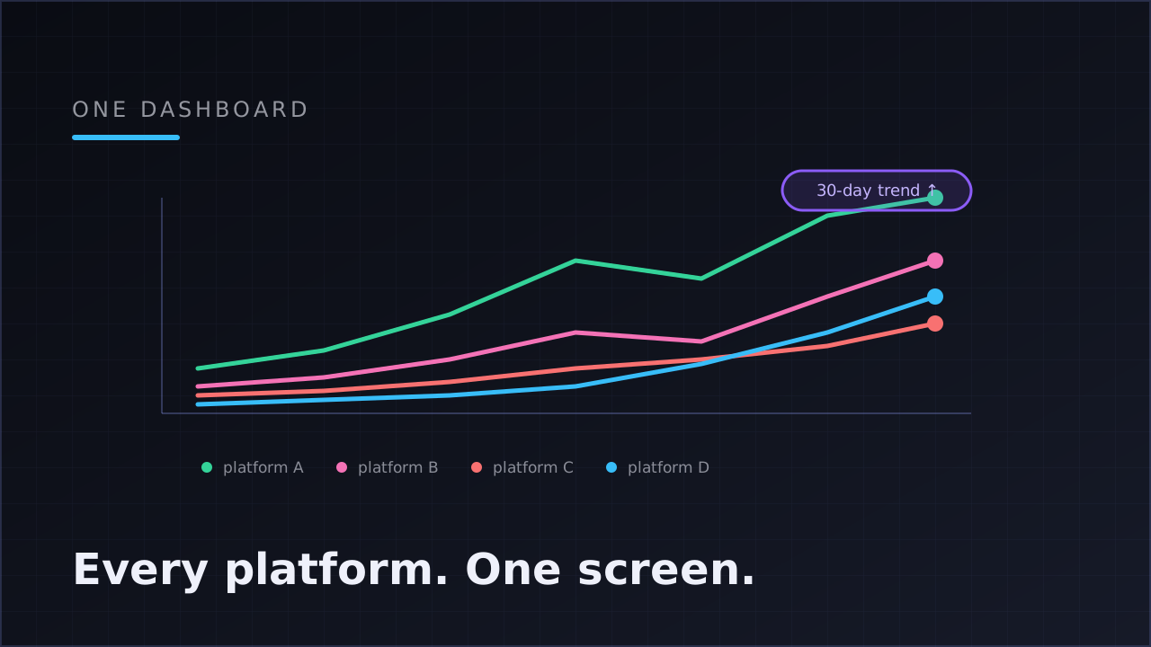
Klipsy's project dashboard pulls views, likes and comments hourly through each platform's official API, plus shares where the platform exposes them (currently TikTok). Every number is attached to the exact post and platform that earned it, then rolled up into a 30-day view with one line per connected platform, so you can watch TikTok, YouTube, Instagram and X move against each other on the same axis instead of holding four numbers in your head.
Why per-platform lines beat a single blended total
A blended "total views across all platforms" number is comforting and mostly useless — it goes up when one platform has a great week and hides that another is flat or declining. Per-platform lines on one chart answer the question that actually changes behavior: where is this working right now?
That's a moving target. The same video can behave completely differently depending on which platform's recommendation system evaluates it — different audience, different signals, different judgment. Watching the lines diverge over weeks tells you where to lean in, without needing to log into anything.
What the chart is for (and what it isn't)
The 30-day chart is a trend tool, not a forensic one. It's built to answer:
| Question | What to look at |
|---|---|
| Is this platform growing for us? | The slope of its line over 30 days |
| Did we have an unusually good or bad week? | A visible bend, up or down |
| Which platform should get more of our attention this month? | Which line is separating from the others |
| Did a single post skew the week? | Cross-check against the top-posts list, not the trend line alone |
It's not built to answer "why" — that's a job for reading the top-performing posts underneath the chart and, one level deeper, which content template produced them. A trend tells you where; template attribution tells you what to make next. That's the subject of which content template actually performs best.
The one-minute weekly check
A dashboard only pays off if you actually open it. The version worth building a habit around takes under a minute:
- Scan the four lines. Is anything diverging from where it was last week?
- Check the top posts. Do they cluster on one platform, or spread evenly?
- Note, don't act, on single-week moves. One good week isn't a trend; three consecutive weeks is.
Collection should run continuously in the background — that's automation's job. Reading should be a weekly, five-minute habit, not a daily compulsion; short-form numbers are too noisy at daily granularity to justify checking more often, a point covered in more depth in social media analytics: which metrics actually matter.
FAQ
Can I see TikTok, YouTube, Instagram and X performance in one place?
Yes — Klipsy's project dashboard tracks views, likes and comments (plus shares where the platform provides them) across all four connected platforms, on one 30-day chart with a separate line per platform.
How often is the data updated?
Collection runs hourly, per post, pulled directly through each platform's official API — not scraped, not estimated.
Do I need to check analytics every day?
No. Collection should be constant; reading should be weekly. Daily checking mostly adds noise, since short-form performance is too volatile at day-level granularity to act on.
What if I'm only connected to one or two platforms?
The dashboard shows whichever platforms are connected — a platform with no connected account simply doesn't appear as a line, and you can add more at any time from the connections page.
Does the dashboard tell me why a platform is trending up or down?
Not directly — the trend tells you where, and the top-posts list plus template attribution tell you why. Pair the two views rather than reading the chart alone.